
jQuery API jqPlot 을 사용하여 그래프 그리기
jqPlot 을 사용하여 통계 데이터를 가로/세로형 막대그래프, 선형그래프, 원형그래프 등으로 쉽게 표현 할 수 있다.
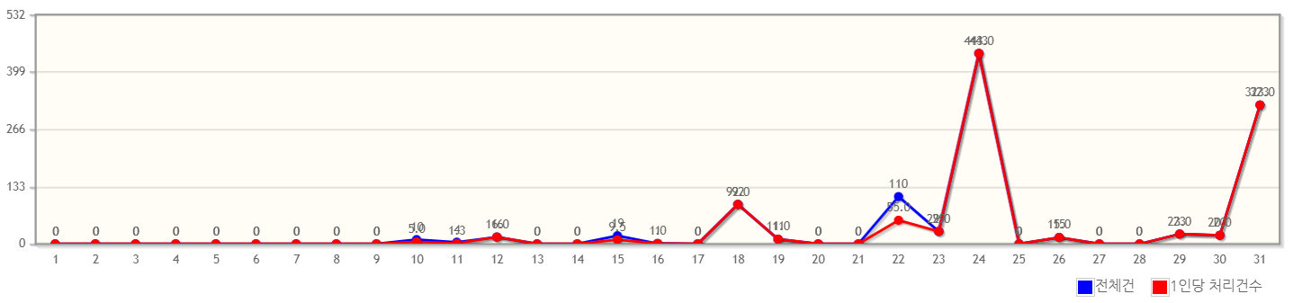
* 세로형 선형그래프를 아래와 같이 구현해 보았다.
1. js import
|
1
2
3
4
5
6
7
8
9
10
|
<link rel="stylesheet" type="text/css" href="${rq.getContextPath()}/resources/css/jquery.jqplot.css">
<script type="text/javascript" src="${rq.getContextPath()}/resources/js/jqplot/jquery.jqplot.min.js"></script>
<script type="text/javascript" src="${rq.getContextPath()}/resources/js/jqplot/jquery.jqplot.js"></script>
<script type="text/javascript" src="${rq.getContextPath()}/resources/js/jqplot/plugins/jqplot.enhancedLegendRenderer.js"></script>
<script type="text/javascript" src="${rq.getContextPath()}/resources/js/jqplot/plugins/jqplot.barRenderer.js"></script>
<script type="text/javascript" src="${rq.getContextPath()}/resources/js/jqplot/plugins/jqplot.highlighter.js"></script>
<script type="text/javascript" src="${rq.getContextPath()}/resources/js/jqplot/plugins/jqplot.categoryAxisRenderer.js"></script>
<script type="text/javascript" src="${rq.getContextPath()}/resources/js/jqplot/plugins/jqplot.cursor.js"></script>
<script type="text/javascript" src="${rq.getContextPath()}/resources/js/jqplot/plugins/jqplot.pointLabels.js"></script>
|
cs |
jqPlot 을 사용하기 위해 관련 js를 import 한다.
2. 데이터 set
|
1
2
3
4
5
6
7
8
9
10
11
12
13
14
15
16
17
18
19
20
21
22
23
24
|
fn_csCntChart : function () {
var barData1 = [];
var barData2 = [];
var ticks = [];
var labels = ['전체건수', '1인당 처리건수'];
<c:forEach var="list" items="${statsList}" >
barData1.push("${list.cnt}");
barData2.push("${list.cntPerEmp}")
ticks.push("${list.graphDt}");
</c:forEach>
var csCntMaxValue = Math.max.apply(null, barData1); //전체 데이터 중 최대 값
if(ticks.length > 1){
csCntMaxValue = csCntMaxValue*1.2; //전체 데이터 최대 값 * 1.2
}else{
csCntMaxValue = 10000; //모든 데이터 값이 0인 경우 차트 최대값을 10000으로 set
}
var campChart = $.jqplot('chartArea', [barData1, barData2], {
//차트 속성 설정
}
|
cs |
6 Line: 데이터의 범례(각각의 그래프가 의미하는 정보 : 전체건수, 1인당 처리건수)는 lables 배열에 담는다
9 Line: 서버에서 전달한 statsList 데이터(list)에서 cnt (전체건수) 값을 barData1 array에 담는다.
10 Line:서버에서 전달한 statsList 데이터(list)에서 cntPerEmp(1인당 처리건수) 값을 barData2 array에 담는다.
11 Line : 데이터의 기준점(그리드에서 가로축)이 되는 날짜(graphDt)를 ticks 배열에 담는다.
ticks 는 차트 옵션을 지정할 때 사용한다.
14 ~ 20 Line :
그리드 세로축의 최대값을 제한.
전체건수와 1인당 처리건수 중 전체건수의 값이 당연히 클 것임으로 list 중 전체건수의 최대 값을 뽑아낸 후 1.2를 곱한 값을 세로축의 최대값으로 사용한다.
만약 조회된 데이터가 없는 경우 세로축의 최대값을 1만으로 제한한다.
22 Line:
'chartArea' : 차트를 그릴 태그 id (id가 'chartArea' 인 tag에 완성된 차트가 그려지게 된다)
array barData1, barData2 를 array 에 다시 담아 jqplot 의 파라미터로 전달한다.
3. 차트 옵션 지정
|
1
2
3
4
5
6
7
8
9
10
11
12
13
14
15
16
17
18
19
20
21
22
23
24
25
26
27
28
29
30
31
32
33
34
35
36
37
38
39
40
41
42
43
44
45
46
47
48
49
50
51
52
53
54
55
56
57
58
59
60
|
var campChart = $.jqplot('campChartMonth', [barData1, barData2], {
animate: true,
animateReplot: true,
cursor: {
show: true,
zoom: false,
looseZoom: false,
showTooltip: false
},
series:[
{
color : 'blue',
renderer: $.jqplot.LineRenderer,
} ,
{
color : 'red',
renderer: $.jqplot.LineRenderer,
}
],
axesDefaults: {
pad: 0
},
/*그래프 범례*/
legend: {
renderer: $.jqplot.EnhancedLegendRenderer,
show: true,
location: 's',
labels: labels,
rendererOptions:{
numberRows :1
},
placement: 'outsideGrid',
},
axes: {
xaxis: {
renderer: $.jqplot.CategoryAxisRenderer,
ticks: ticks,
drawMajorGridlines: false,
drawMinorGridlines: true,
drawMajorTickMarks: false,
},
yaxis: {
max: csCntMaxValue,
min: 0,
tickOptions: {
formatString: "%'d"
},
rendererOptions: {
forceTickAt0: true
}
},
},
highlighter: {
show: true,
showLabel: true,
tooltipAxes: 'y',
sizeAdjust: 7.5 , tooltipLocation : 'ne'
},
});
|
cs |
series : 각각의 선형그래프 관련 설정 (첫번째 그래프선을 blue로, 두번째 그래프선을 red 색상으로 지정)
그래프의 형태는 선형그래프로 지정 (LineRenderer) (막대그래프는 BarRenderer)
legend : 그래프 범례 관련 설정 (위치를 그래프와 겹치지 않도록 바깥에 설정 (placement : outsideGrid))
범례를 한줄로 설정 (rendererOptions : numberRows 1)
axes :
그리드 관련 설정
xaxis : x 축 ( 세로형 선형그래프이므로 x 축에 ticks : ticks(graphDt 값을 담고있는 배열) 선언으로 데이터의 기준점(날짜기준(graphDt))을 셋팅 )
yaxis : y 축
* 가로형 그래프로 그릴 경우 x 축 y 축 설정을 반대로 주고,
그래프 데이터를 인자값으로 넘길 때 2차원 배열형태를 조금 더 신경 써서 만들어야 한다.
참고 : 아래 사이트에 예제를 비롯한 각각의 옵션들이 친절하고 자세하게 설명이 되어있다. 영어로...
http://www.jqplot.com/examples/barTest.php
Bar Charts
www.jqplot.com
'front > javascript' 카테고리의 다른 글
| Airbnb javascript 개발 가이드 (0) | 2019.09.13 |
|---|---|
| 공통 팝업 확장 및 구현하기 : Customized PopUp (alert, confirm, loading) (0) | 2019.09.11 |
| localStorage vs sessionStorage (0) | 2019.09.10 |
| Mysql hierarchy sql 계층구조 쿼리 2 : 그리기(Multi selectbox) (0) | 2019.08.23 |
| submit, replace, href 차이 (0) | 2019.08.12 |